Responsive Webdesign
tussen []: optioneel, sterk aanbevolen voor wie wil verdergaan in web
gebruik pijltjestoetsen om te navigeren
dotted codepanels zijn editeerbaar
Responsive Webdesign
Responsive in 3 stappen
Definitie
Responsive design is gericht op het bieden van een optimale gebruikservaring over een breed gamma aan schermresoluties en toestellen met één enkele site, codebasis en inhoud.
Responsive webdesign
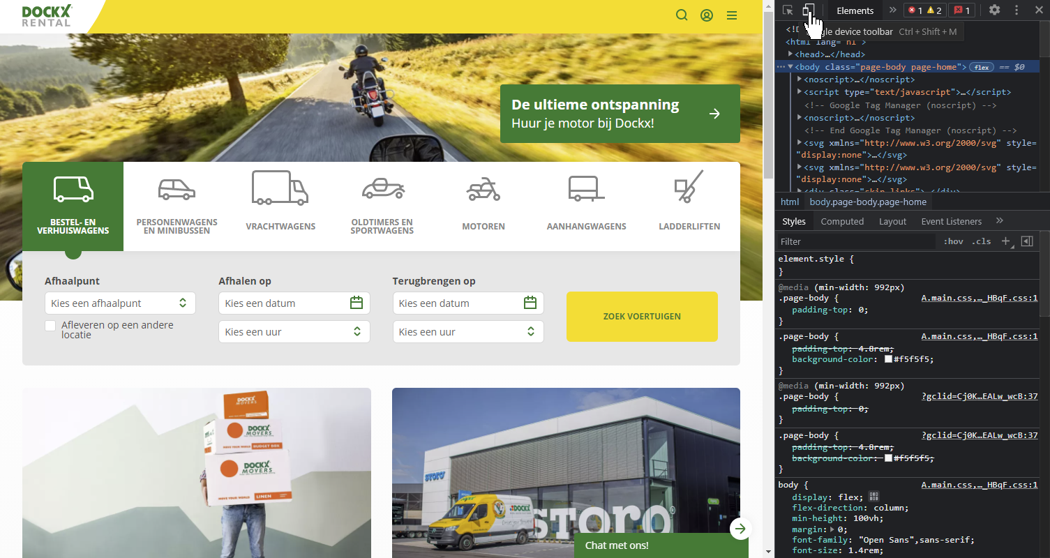
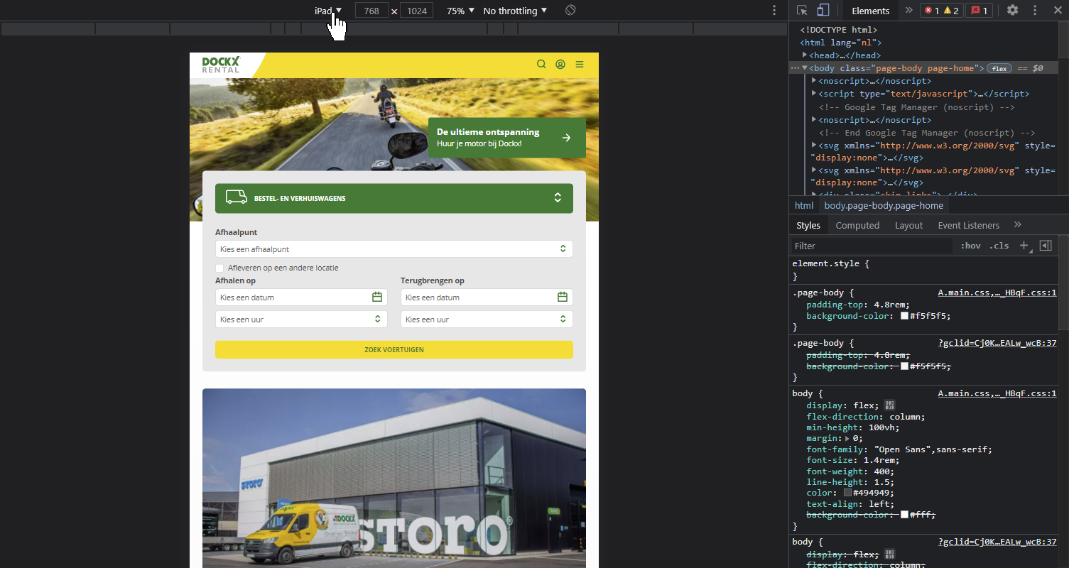
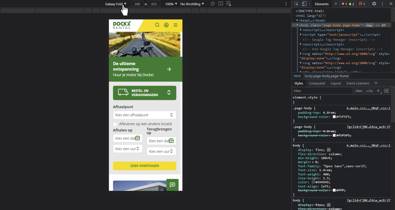
- De site moet zich dus optimaal aanpassen ('respond') aan elke schermbreedte. Je kan in Chrome Inspector verschillende toestellen testen met de device toggle:
- het is dus één site, één code die er op alle toestellen geven goed moet uitzien
Content choreografie
-
Bij smaller wordende schermen zullen elementen (teksten, afbeeldingen, kaders, kolommen...) moeten herschalen / verspringen / verdwijnen. Dit noemt men de content choreografie:
- elementen uitrekken / platduwen → flexibiliteit
- elementen herschikken → fluïditeit
- elementen toevoegen / verwijderen
- elementen aanpassen
- ...
- Er zijn geen echte regels over wat precies wanneer moet gebeuren; dit is geheel aan jou. Probeer bredere / smallere schermen, en kijk wat goed voelt.
Responsive in 3 stappen
-
stap 1: controleer of de viewport meta aanwezig is in de
<head> -
stap 2: maak de layout flexibel (wrapper, kolommen, foto's, boxen...)
- gebruik zoveel mogelijk flexbox voor layout
- maak de eventuele wrapper flexibel: vervang
widthdoormin-widthenmax-width - maak eventuele kolommen flexibel: zet breedtes in percentages in plaats van vaste waarden
- maak de hoogte van container elementen flexibel: verwijder height
- maak kaders en foto's flexibel: stel
widthop 100% en stel eventueelmax-widthin
-
stap 3: voeg media queries toe
- versmal/verbreed het browservenster en kies een breekpunt
- voeg een media query toe voor dit breekpunt (gebruik altijd
min-width) - voeg responsive CSS toe aan de media query en verander/verwijder eventueel andere CSS
- controleer het resultaat en keer terug naar punt a tot je tevreden bent
Stap 1: viewport metatag
-
Laat je mobiel toestel weten dat de site responsive is, zoniet zal het proberen de desktopversie van de site te herschalen en persen in het kleine scherm. Het is niet meer dan één viewport metatag toevoegen aan je HTML:
<head> ... <meta name="viewport" content="width=device-width, initial-scale=1.0"> ... </head> -
Irritant genoeg kom je ook deze versie tegen, maar die laat de gebruiker niet inzoomen:
<meta name="viewport" content="width=device-width, minimum-scale=1.0, maximum-scale=1.0">
Stap 2A: flexibele layout
- Gebruik voor layout zoveel mogelijk flexbox, bv.:
header #logo {
  position: absolute;
  top: 20px;
  left: 10px;
}

header #login {
  position: absolute;
  top: 20px;
  right: 10px;
}
header { align-items: flex-start; display: flex; justify-content: space-between; padding: 20px 10px; } - zou normaal gezien al ok moeten zijn
Stap 2B: flexibele wrapper
-
Stel
min-widthenmax-widthin op wrappers in plaats vanwidth:.wrapper { width: 960px; }.wrapper { max-width: 960px; min-width: 320px; }
Stap 2C: flexibele kolommen
- Gebruik geen
pxmaar%voor kolombreedtes — gebruikcalc()indien nodig:.leftcol { width: 640px; } .rightcol { width: 280px; }.leftcol { width: 67%; } .rightcol { margin-left: 40px; width: calc (33% - 40px); } - andere combinaties zijn mogelijk, zolang de som maar 100% is: 67% + 40px + (33% - 40px)
Stap 2d: flexibele hoogtes
- Verwijder
heightvan verticaal flexibele elementen, bv. de header; het zal verticaal moeten kunnen uitrekken bij smalle schermen naarmate child elementen verschuiven:header { height: 250px; }header { }
Stap 2E: flexible blokken
- Stel voor afbeeldingen en andere flexibele blokken met een maximum breedte de
widthenmax-widthproperties in:main img { width: 450px; /* natuurlijke breedte */ max-width: 100%; /* mag nooit breder dan de parent zijn */ }
stap 3A: bepaal breekpunt
-
Een breekpunt is de browserbreedte vanaf waar veranderingen aan de CSS nodig zijn. Een breekpunt bepalen is makkelijk:
- open je pagina in de browser
- maak je browservenster smaller (het zou al flexibel moeten zijn)
- de breedte waar het design er niet meer goed uitziet, is je breekputn
- Er zijn geen 'aanbevolen' breekpunten; kies wat past bij je design.
step 2B: voeg media query toe
-
Stel dat je een overgang wil op 800px, dan komt er onderaan je CSS dit blok bij:
/* CSS voor smalste schermen */ ... /* =============== Media queries =============== */ @media (min-width: 800px) { /* deze CSS wordt uitgevoerd vanaf 800px */ } - zet je media queries op het einde van je CSS
-
gebruik altijd
min-width, geenmax-widthof een combinatie
stap 2C: responsive CSS
-
Voeg nu CSS toe aan de media query en pas eventueel andere CSS aan. Wil je bijvoorbeeld een groter lettertype en wat meer ondermarge voor
<h2>vanaf 800px?/* algemene instelling */ h2 { font-size: 16px; margin: 10px 0; } @media (min-width: 800px) { /* vanaf 800px */ h2 { font-size: 20px; /* iets groter lettertype */ margin-bottom: 15px; /* wat meer ondermarge */ } } - meer dan dat is het niet! het is even wennen, maar daarna gaat het vanzelf
step 2D: meer breekpunten
-
Controleer je resultaat, en voeg eventueel meer breekpunten toe, van klein naar groot:
/* CSS voor smalste schermen */ ... /* =============== Media queries =============== */ @media (min-width: 600px) { /* vanaf 600px */ ... } @media (min-width: 800px) { /* vanaf 800px */ ... } @media (min-width: 1000px) { /* vanaf 1000px */ ... } - zet je media queries op het einde van je CSS
- sorteer je breekpunten van klein naar groot
-
gebruik enkel
min-width, geenmax-widthof een combinatie, of het wordt een soep!
De algemene filosofie voor responsive CSS is "mobile first", i.e. bouw je CSS voor het smalste scherm, en pas het aan met media queries voor bredere schermen. Het alternatief, "desktop first", zou veronderstellen dat je eerst de CSS schrijft voor het breedste scherm, en het dan aanpast voor smallere schermen. Gezien de CSS voor brede schermen meestal complexer is dan dat voor smalle schermen, is het beter om te werken van kleine schermen naar grote schermen dan omgekeerd. Dit leidt tot minder complexe CSS.
[responsive afbeeldingen]
-
Een foto bedoeld voor de desktop weergave van een site is meestal veel te groot voor de mobiele versie. Het zou dus handig zijn verschillende versies van een afbeelding te kunnen specifiëren. Gelukkig hebben we daarvoor het
<picture>element ter beschikking:<picture alt="Spelend kind, Iran, 2009"> <source srcset="img/photo_large.jpg" media="(min-width: 1000px)"> <source srcset="img/photo_medium.jpg" media="(min-width: 700px)"> <img src="img/photo_small.jpg" alt=""> </picture> - we werken nu in het volgende deel een stap voor stap demo uit.
Responsive Webdesign
Stap voor stap demo
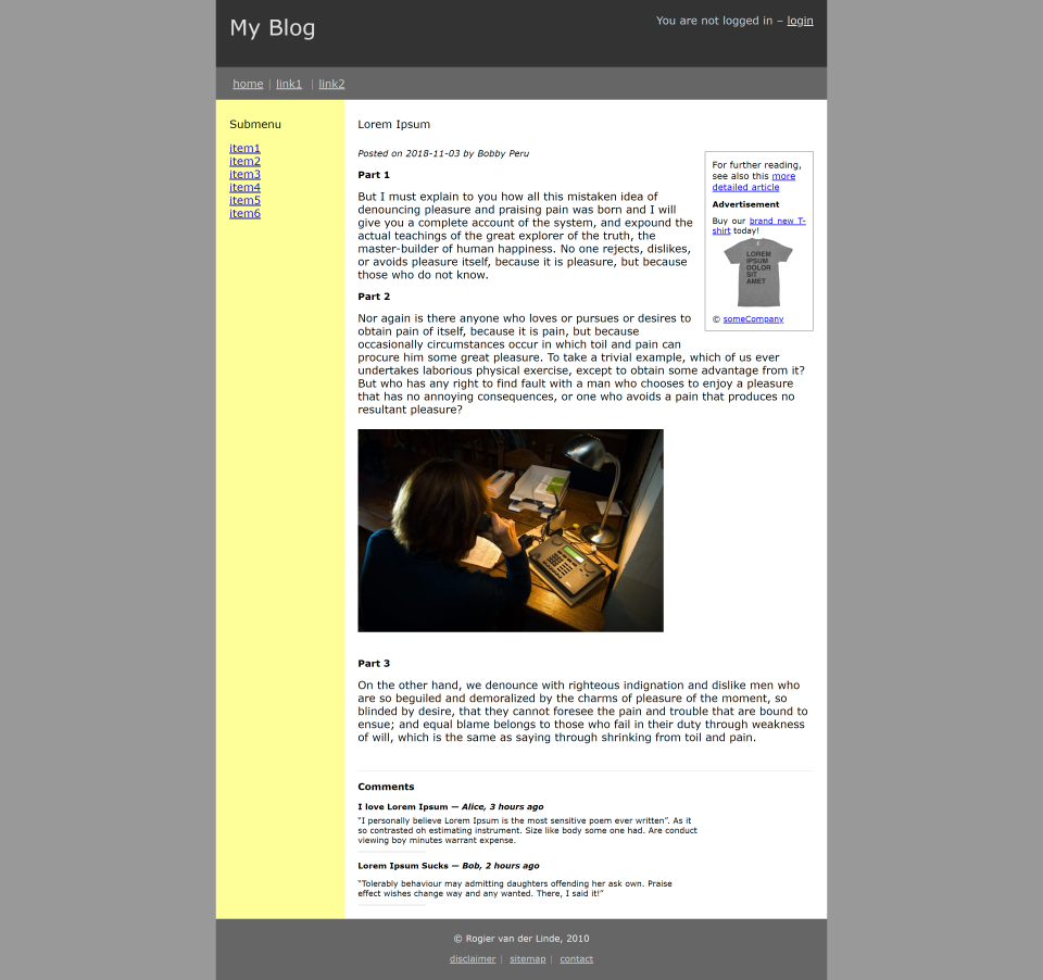
Gewenst resultaat
- We willen deze pagina responsive maken:
CSS startversie
- We nemen aan dat we al volgende CSS hebben, in px, niet flexibel en niet responsive:
-
/**
 *
 * Styles
 * @author Rogier van der Linde
 *
 */


/* Reset
/* ============== */

* {
   box-sizing: border-box; /* corrigeer het box model */
   margin: 0; /* wis verschillen tussen browsers uit */
   padding: 0; /* wis verschillen tussen browsers uit */
}

img {
   border: 0;
}

/* General
/* ============== */

body {
  background-color: #999;
  font-family: Verdana;
  font-size: 16px;
}
h2, h3, h4, h5 {
  margin: 1em 0;
}
h3 {
  font-size: 16px;
  font-weight: normal;
}
h4 {
  font-size: 14px;
}
h5 {
  font-size: 12px;
  font-weight: normal;
}

/* site wrapper */
#wrapper {
  width: 900px;
  margin: 0 auto;
  background-color: white;
}


/* Header
/* ============== */

header {
  align-items: flex-start;
  background-color: #333;
  color: #ccc;
  display: flex;
  flex-flow: row nowrap;
  justify-content: space-between;
  height: 100px;
  padding: 20px;
  position: relative;
}
header h1 a {
  font-weight: normal;
  text-decoration: none;
}
header a {
  color: #ddd;
}
.header_login {
  text-align: right;
}
.header_login a:hover {
  color: white;
}


/* Menu
/* ============== */

/* top menu */
header + nav {
  background-color: #666;
  padding: 10px 20px;
}
#mainmenu {
  display: block;
}
#mainmenu li {
  display: inline-block;
}
#mainmenu a {
  color: #ccc;
  display: inline-block;
  height: 28px;
  line-height: 24px;
  padding: 2px 5px;
  text-align: center;
  width: 50px;
}
#mainmenu li + li:before {
  color: #999;
  content: '|';
}


/* Main
/* ============== */

main {
  display: flex;
  flex-flow: row nowrap;
}

/* sub menu */
#leftmenu {
  background-color: #FEFF99;
  padding: 10px 20px;
  width: 190px;
}
#leftmenu ul {
  list-style: none;
}

/* content */
#content {
  padding: 10px 20px;
  width: 710px;
}
.content_header {
  font-size: smaller;
  font-style: italic;
  margin-bottom: 15px;
  margin-top: 25px;
}
.content_picture {
  margin: 20px 0;
  width: 450px;
}

/* aside */
main aside {
  border: 1px solid gray;
  float: right;
  font-size: smaller;
  margin: 15px 0 10px 10px;
  padding: 10px;
  width: 160px;
}
main aside article {
  font-size: 12px;
  margin-top: 10px;
  text-align: justify;
}
.article_visual {
  display: block;
  margin: 0 auto;
  width: 80%;
}
main aside article p:last-child {
  margin-top: 5px;
}
main aside article h1 {
  margin: 10px 0;
}

/* comments */

#comments {
  border-top: 1px dotted #ccc;
  font-size: 12px;
  margin-top: 40px;
}
.comment {
  width: 500px;
}
.comment_title {
  margin-bottom: 0.5em;
  font-weight: 600;
}
.comment::after {
  border-top: 1px solid #ccc;
  content: "";
  display: block;
  margin: 10px 0;
  width: 100px;
}
.comment_author {
  font-style: italic;
}


/* Footer
/* ============== */

footer {
  background-color: #666;
  color: #eee;
  font-size: smaller;
  padding: 10px;
  text-align: center;
}

footer a {
  color: #ccc;
}

footer p, footer ul  {
  margin: 10px 0;
}

footer ul {
  list-style: none;
  padding: 0;
}

footer li {
  display: inline-block;
}

footer ul a {
  display: inline;
  line-height: 24px;
  padding: 2px 5px;
}
footer li + li:before {
  content: ' | ';
  color: #999;
}
Stap 1: viewport meta
-
Controleer of de viewport metatag aanwezig is in de
<head>: -
<!DOCTYPE html>
  <html lang="en">
  <head>
    <title>Classical Page Layout</title>
    <meta charset="utf-8">
    <meta name="viewport" content="width=device-width, initial-scale=1.0">
    <link rel="stylesheet" href="css/styles.css">
  </head>
  <body>
    <div id="wrapper">
      <header>
        <h1><a href="#">My Blog</a></h1>
        <p class="header_login">You are not logged in – <a href="#">login</a></p>
      </header>
      <nav id="mainmenu">
        <ul>
          <li><a href="#">home</a></li>
          <li><a href="#">link1</a></li>
          <li><a href="#">link2</a></li>
        </ul>
      </nav>
      <main>
        <nav id="leftmenu">
          <h3>Submenu</h3>
          <ul>
            <li><a href="#">item1</a></li>
            <li><a href="#">item2</a></li>
            <li><a href="#">item3</a></li>
            <li><a href="#">item4</a></li>
            <li><a href="#">item5</a></li>
            <li><a href="#">item6</a></li>
          </ul>
        </nav>
        <section id="content">
          <h3>Lorem Ipsum</h3>
          <aside>
            <section>
              <p>
                For further reading, see also this
                <a href="#">more detailed article</a>
              </p>
            </section>
            <article class="ad">
              <h1>Advertisement</h1>
              <p>Buy our <a href="#">brand new T-shirt</a> today!</p>
              <img src="img/shirt.png" alt="shirt" class="article_visual">
              <p>© <a href="#">someCompany</a></p>
            </article>
          </aside>
          <p class="content_header">Posted on 2018-11-03 by Bobby Peru</p>
          <h4>Part 1</h4>
          <p>
            But I must explain to you how all this mistaken idea of denouncing pleasure
            and praising pain was born and I will give you a complete account of the
            system, and expound the actual teachings of the great explorer of the truth,
            the master-builder of human happiness. No one rejects, dislikes, or avoids
            pleasure itself, because it is pleasure, but because those who do not know.
          </p>
          <h4>Part 2</h4>
          <p>
            Nor again is there anyone who loves or pursues or desires to obtain pain of
            itself, because it is pain, but because occasionally circumstances occur in
            which toil and pain can procure him some great pleasure. To take a trivial
            example, which of us ever undertakes laborious physical exercise, except to
            obtain some advantage from it? But who has any right to find fault with a
            man who chooses to enjoy a pleasure that has no annoying consequences, or
            one who avoids a pain that produces no resultant pleasure?
          </p>
          <p>
            <img src="img/picture.jpg" alt="just some picture" class="content_picture">
          </p>
          <h4>Part 3</h4>
          <p>
            On the other hand, we denounce with righteous indignation and dislike men who
            are so beguiled and demoralized by the charms of pleasure of the moment, so
            blinded by desire, that they cannot foresee the pain and trouble that are
            bound to ensue; and equal blame belongs to those who fail in their duty
            through weakness of will, which is the same as saying through shrinking from
            toil and pain.
          </p>
          <section id="comments">
            <h4>Comments</h4>
            <article class="comment">
              <h5 class="comment_title">
                I love Lorem Ipsum <span class="comment_author">
                — Alice, 3 hours ago</span>
                </h5>
              <p>
                “I personally believe Lorem Ipsum is the most sensitive poem ever
                written”. As it so contrasted oh estimating instrument. Size like
                body some one had. Are conduct viewing boy minutes warrant expense.
              </p>
            </article>
            <article class="comment">
              <h5 class="comment_title"
                >Lorem Ipsum Sucks <span class="comment_author">
                — Bob, 2 hours ago</span>
              </h5>
              <p>“Tolerably behaviour may admitting daughters offending her ask own.
              Praise effect wishes change way and any wanted. There, I said it!”</p>
            </article>
          </section>
        </section>
      </main>
      <footer>
        <p>© Rogier van der Linde, 2010</p>
        <ul>
          <li><a href="#">disclaimer</a>
          <li><a href="#">sitemap</a>
          <li><a href="#">contact</a>
        </ul>
      </footer>
    </div>
  </body>
  </html>
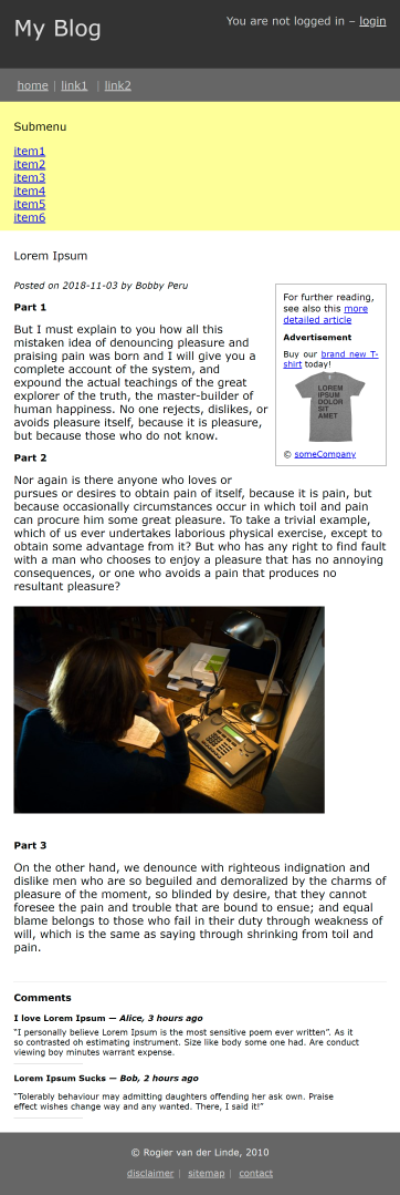
Stap 2: maak flexibel
-
Verandeingen:
- wrapper:
max-widthenmin-widthgebruikt i.p.v.width - header:
heightverwijderd, vervangen doorpadding-bottom - linkermenu en content: absolute breedtes vervangen door percentages
- content foto en comments:
widthveranderd naar 100%,max-widthingesteld
- wrapper:
-
/**
 *
 * Styles
 * @author Rogier van der Linde
 *
 */

/* Reset
/* ============== */

* {
  box-sizing: border-box; /* corrigeer het box model */
  margin: 0; /* wis verschillen tussen browsers uit */
  padding: 0; /* wis verschillen tussen browsers uit */
}

img {
  border: 0;
}

/* General
/* ============== */

body {
  background-color: #999;
  font-family: Verdana;
  font-size: 16px;
}
h2, h3, h4, h5 {
  margin: 10px 0;
}
h3 {
  font-size: 16px;
  font-weight: normal;
}
h4 {
  font-size: 14px;
}
h5 {
  font-size: 12px;
  font-weight: normal;
}

/* site wrapper */
#wrapper {
  max-width: 900px;
  min-width: 240px;
  margin: 0 auto;
  background-color: white;
}


/* Header
/* ============== */

header {
  align-items: flex-start;
  background-color: #333;
  color: #ccc;
  display: flex;
  flex-flow: row nowrap;
  justify-content: space-between;
  padding: 20px;
  padding-bottom: 40px;
  position: relative;
}
header h1 a {
  font-weight: normal;
  text-decoration: none;
}
header a {
  color: #ddd;
}
.header_login {
  text-align: right;
}
.header_login a:hover {
  color: white;
}


/* Menu
/* ============== */

/* top menu */
header + nav {
  background-color: #666;
  padding: 10px 20px;
}
#mainmenu {
  display: block;
}
#mainmenu li {
  display: inline-block;
}
#mainmenu a {
  color: #ccc;
  display: inline-block;
  height: 28px;
  line-height: 24px;
  padding: 2px 5px;
  text-align: center;
  width: 50px;
}
#mainmenu li + li:before {
  color: #999;
  content: '|';
}


/* Main
/* ============== */

main {
  display: flex;
  flex-flow: row nowrap;
}

/* sub menu */
#leftmenu {
  background-color: #FEFF99;
  padding: 10px 20px;
  width: 21%;
}
#leftmenu ul {
  list-style: none;
}

/* content */
#content {
  padding: 10px 20px;
  width: 79%;
}
.content_header {
  font-size: smaller;
  font-style: italic;
  margin-bottom: 15px;
  margin-top: 25px;
}
.content_picture {
  margin: 20px 0;
  max-width: 450px;
  width: 100%;
}


/* aside */
main aside {
  border: 1px solid gray;
  float: right;
  font-size: smaller;
  margin: 15px 0 10px 10px;
  padding: 10px;
  width: 160px;
}
main aside article {
  font-size: 12px;
  margin-top: 10px;
  text-align: justify;
}
.article_visual {
  display: block;
  margin: 0 auto;
  width: 80%;
}
main aside article p:last-child {
  margin-top: 5px;
}
main aside article h1 {
  margin: 10px 0;
}

/* comments */

#comments {
  border-top: 1px dotted #ccc;
  font-size: 12px;
  margin-top: 40px;
}
.comment {
  max-width: 500px;
  width: 100%;
}
.comment_title {
  margin-bottom: 0.5em;
  font-weight: 600;
}
.comment::after {
  border-top: 1px solid #ccc;
  content: "";
  display: block;
  margin: 10px 0;
  width: 100px;
}
.comment_author {
  font-style: italic;
}


/* Footer
/* ============== */

footer {
  background-color: #666;
  color: #eee;
  font-size: smaller;
  padding: 10px;
  text-align: center;
}

footer a {
  color: #ccc;
}

footer p, footer ul  {
  margin: 10px 0;
}

footer ul {
  list-style: none;
  padding: 0;
}

footer li {
  display: inline-block;
}

footer ul a {
  display: inline;
  line-height: 24px;
  padding: 2px 5px;
}
footer li + li:before {
  content: ' | ';
  color: #999;
}
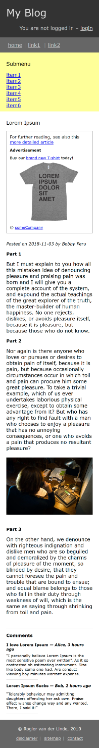
Stap 3: media queries
-
Veranderingen:
- media queries toegevoegd voor 480px en 600px
- CSS voor header layout en aside float verhuisd naar eerste media query
- CSS voor main content kolom layout verhuisd naar laatste last media query
-
/**
 *
 * Styles
 * @author Rogier van der Linde
 *
 */


/* Reset
/* ============== */

* {
  box-sizing: border-box; /* corrigeer het box model */
  margin: 0; /* wis verschillen tussen browsers uit */
  padding: 0; /* wis verschillen tussen browsers uit */
}

img {
  border: 0;
}

/* General
/* ============== */

body {
  background-color: #999;
  font-family: Verdana;
  font-size: 16px;
}
h2, h3, h4, h5 {
  margin: 1em 0;
}
h3 {
  font-size: 16px;
  font-weight: normal;
}
h4 {
  font-size: 14px;
}
h5 {
  font-size: 12px;
  font-weight: normal;
}

/* site wrapper */
#wrapper {
  max-width: 900px;
  min-width: 240px;
  margin: 0 auto;
  background-color: white;
}


/* Header
/* ============== */

header {
  align-items: flex-start;
  background-color: #333;
  color: #ccc;
  padding: 20px;
  position: relative;
}
header h1 {
  margin-bottom: 20px;
}
header h1 a {
  font-weight: normal;
  text-decoration: none;
}
header a {
  color: #ddd;
}
.header_login {
  text-align: right;
}
.header_login a:hover {
  color: white;
}


/* Menu
/* ============== */

/* top menu */
header + nav {
  background-color: #666;
  padding: 10px 20px;
}
#mainmenu {
  display: block;
}
#mainmenu li {
  display: inline-block;
}
#mainmenu a {
  color: #ccc;
  display: inline-block;
  height: 28px;
  line-height: 24px;
  padding: 2px 5px;
  text-align: center;
  width: 50px;
}
#mainmenu li + li:before {
  color: #999;
  content: '|';
}


/* Main
/* ============== */

/* sub menu */
#leftmenu {
  background-color: #FEFF99;
  padding: 10px 20px;
}
#leftmenu ul {
  list-style: none;
}

/* content */
#content {
  padding: 10px 20px;
}
.content_header {
  font-size: smaller;
  font-style: italic;
  margin-bottom: 15px;
  margin-top: 25px;
}
.content_picture {
  margin: 20px 0;
  max-width: 450px;
  width: 100%;
}

/* aside */
main aside {
  border: 1px solid gray;
  font-size: smaller;
  margin: 15px 0 10px 0;
  padding: 10px;
}
main aside article {
  font-size: 12px;
  margin-top: 10px;
  text-align: justify;
}
.article_visual {
  display: block;
  margin: 0 auto;
  width: 80%;
}
main aside article p:last-child {
  margin-top: 5px;
}
main aside article h1 {
  margin: 10px 0;
}

/* comments */

#comments {
  border-top: 1px dotted #ccc;
  font-size: 12px;
  margin-top: 40px;
}
.comment {
  max-width: 500px;
  width: 100%;
}
.comment_title {
  margin-bottom: 0.5em;
  font-weight: 600;
}
.comment::after {
  border-top: 1px solid #ccc;
  content: "";
  display: block;
  margin: 10px 0;
  width: 100px;
}
.comment_author {
  font-style: italic;
}

/* ===========================================
  Footer
  =========================================== */

footer {
  background-color: #666;
  color: #eee;
  font-size: smaller;
  padding: 10px;
  text-align: center;
}

footer a {
  color: #ccc;
}

footer p, footer ul  {
  margin: 10px 0;
}

footer ul {
  list-style: none;
  padding: 0;
}

footer li {
  display: inline-block;
}

footer ul a {
  display: inline;
  line-height: 24px;
  padding: 2px 5px;
}
footer li + li:before {
  content: ' | ';
  color: #999;
}


/* Media queries
/* ============== */

@media (min-width: 480px) {
  main aside {
    float: right;
    margin-left: 10px;
    width: 160px;
  }
  header {
    display: flex;
    flex-flow: row nowrap;
    justify-content: space-between;
  }
}
@media (min-width: 600px) {
  main {
    display: flex;
    flex-flow: row nowrap;
  }
  #leftmenu {
    width: 21%;
  }
  #content {
    width: 79%;
  }
}